Are you interested in improving the accessibility of your WordPress site?
Accessibility goes beyond catering to individuals with disabilities; it’s about fostering inclusivity online, ensuring everyone can engage with your content effortlessly.
Whether you run a blog, or business, or develop websites, prioritizing accessibility is crucial for reaching a wider audience and delivering an exceptional user experience.
In this article, we’ll delve into effective techniques and resources to improve accessibility on your WordPress site, making it more inviting and user-friendly for all visitors.
Table of Contents
Understanding Accessibility
Accessibility ensures everyone, regardless of their abilities or disabilities, can easily access and use your website or application. It’s like designing a building with ramps and elevators so that everyone can enter and move around comfortably. When we talk about web accessibility, we mean things like making text readable for screen readers, using colors and contrasts that are easy to see, and providing alternatives for content like images and videos for those who can’t see them. Essentially, it’s about creating a digital space that’s inclusive and welcoming to everyone.
Why Accessibility Matters for Your WordPress Site
Accessibility matters for WordPress sites for several reasons:
- Improved User Experience: Accessibility features often benefit all users, not just those with disabilities. For example, providing alternative text for images not only helps visually impaired users understand the content but also improves SEO and assists users on slow internet connections or with images disabled. Similarly, clear navigation and descriptive links benefit users with cognitive disabilities as well as those using screen readers or navigating via a keyboard.
- Expanded Audience Reach: By making your WordPress site accessible, you’re opening it up to a broader audience. This includes people with disabilities who may otherwise be excluded, as well as older individuals who may experience age-related impairments. Additionally, accessible websites are often more usable for users in diverse environments, such as on mobile devices or in noisy surroundings.
- SEO Benefits: Many accessibility practices align with good SEO practices. For example, providing descriptive alt text for images not only helps users with screen readers but also helps search engines understand the content of your images, potentially improving your site’s ranking in search results.
How To Improve Accessibility On Your WordPress Site
Now, let’s explore actionable strategies to improve accessibility on your WordPress site:
Choose an Accessible WordPress Theme
Begin by selecting a WordPress theme that prioritizes accessibility. Look for themes that adhere to web accessibility standards (WCAG) and offer options for customizing colors, fonts, and layouts to ensure compatibility with various user needs.
Enhancing the accessibility of your WordPress website can be easily achieved by installing an accessibility plugin such as the Accessibility app.
When considering a theme, opt for one that prioritizes accessibility, ensuring all users can easily navigate your website. Look for themes that have been reviewed and approved by the Theme Review Team, guaranteeing they meet basic accessibility requirements.
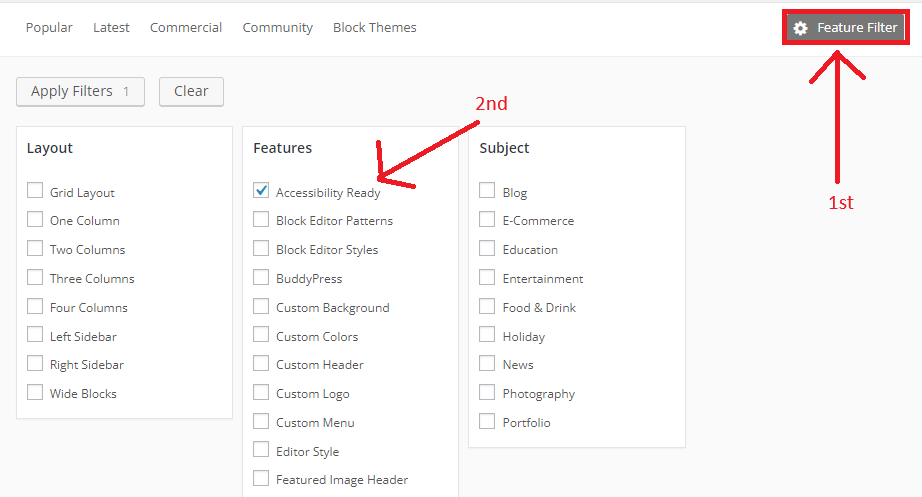
“Within the Features section, you’ll find the “Accessibility Ready” option.”
Although accessibility-ready WordPress themes provide a solid foundation, they may not fully comply with level AA standards of the WCAG. While these themes offer a positive step toward creating a more accessible web, additional work may be required to ensure full compliance.”
Optimize Images with Alt Text
To Improve Accessibility On Your WordPress Site, you need to optimize images with ALT text. Include descriptive alt text for images to provide context and information to users who cannot see them. Alt text should be concise, and descriptive, and convey the purpose of the image.
Implementing Alt Text in WordPress:
- Adding Alt Text During Image Upload: When uploading images to your WordPress site, you’ll encounter an option to add alt text. Use this opportunity to provide a descriptive and relevant alt text for each image. WordPress also allows you to edit alt text for previously uploaded images in the media library.
- Utilizing Image Editing Tools: If you’re editing images within WordPress or using external image editing software, ensure that you include alt text as part of your image optimization process. This ensures consistency and accessibility across all images on your site.
- Using Plugins: Consider using WordPress plugins that automate alt text generation or provide additional features for optimizing images for accessibility. These plugins can streamline the alt text optimization process and ensure compliance with accessibility standards.
- Regular Audits and Updates: Periodically review your website’s images and alt text to ensure they remain accurate and relevant. As your content evolves, update alt text as needed to reflect any changes in image context or content.
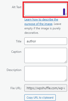
WordPress allows you to add alt text when uploading or editing images.
Implement Semantic HTML
Use proper heading tags (H1, H2, H3, etc.) to organize your content hierarchically. This helps screen readers and users with cognitive disabilities understand the structure of your content.

Use headings to organize your websites. This helps users find their way around and understand how your site is structured. Be consistent with headings across all pages for better accessibility. For example, if you use a main heading <h1> on one page, do the same on others.
Color Contrast
Ensuring adequate color contrast between text and background colors is essential for enhancing readability, especially for users with low vision or color blindness. Tools like WebAIM’s Color Contrast Checker are invaluable resources for evaluating color combinations against WCAG (Web Content Accessibility Guidelines) standards.
The WebAIM Contrast Checker is a user-friendly, free online tool specifically crafted to assess color contrast ratios. By inputting the foreground (text) and background colors, the tool generates a contrast ratio and indicates whether the combination meets WCAG requirements.
By incorporating this tool into your web design process, you can ensure that your WordPress website’s color scheme maintains sufficient contrast, thus improving readability and accessibility for all users. Prioritizing accessibility in your WordPress design not only enhances user experience but also aligns with inclusive design principles, fostering a more welcoming online environment.”
Here’s how you can use it to assess and adjust color combinations on your WordPress site:
- Selecting Text and Background Colors: Choose the text and background colors you intend to use on your website. These may include colors for headings, body text, buttons, and other interface elements.
- Input Color Values: Enter the hexadecimal (hex) color codes or use the color picker tool provided by the Contrast Checker to specify the text and background colors accurately.
- View Contrast Ratio: Once you’ve inputted the color values, the Contrast Checker will display the contrast ratio between the text and background colors. WCAG specifies different contrast ratio requirements depending on the level of conformance (AA or AAA) and text size (normal or large).
- Adjust Color Combinations: If the contrast ratio falls below the recommended threshold, you’ll need to adjust the colors to achieve sufficient contrast. This may involve selecting darker or lighter shades, altering the hue, or using alternative color combinations.
- Verify Accessibility Compliance: After making adjustments, reevaluate the contrast ratio using the Contrast Checker to ensure compliance with WCAG guidelines. Aim to achieve the specified contrast ratios for both normal and large text, as well as for text that appears on interactive elements such as buttons or links.
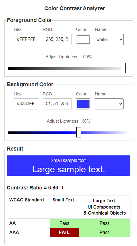
Ensure that the color contrast ratio meets at least 4.5:1 for small text or 3:1 for large text, regardless of whether the text is part of an image. Large text is defined as 18pt (24 CSS pixels) or 14pt bold (19 CSS pixels) according to the requirements. Note that elements with a 1:1 ratio are considered “incomplete” and will need manual review.
Create Descriptive Links
Creating descriptive links involves using anchors (<a>) elements with meaningful text that indicates the destination or purpose of the link. Descriptive links enhance accessibility and user experience by providing context and clarity to users, especially those relying on screen readers.
Here’s how you can create descriptive links on your WordPress site:
Use Clear and Concise Text:
- Write link text that accurately describes the content or action it leads to. Avoid vague or generic phrases like “click here” or “read more.”
- For example, instead of:
html <a href="https://example.com">Click here</a>
Use:html <a href="https://example.com">Visit our homepage</a>
Include Keywords
- Incorporate relevant keywords into your link text to provide additional context and improve SEO.
- However, ensure that the keywords naturally fit within the context of the link and do not disrupt the flow of the content.
- For example:
html <a href="https://example.com">Explore our collection of eco-friendly products</a>
Avoid Repetition:
- If the link text duplicates nearby text, consider rephrasing it to provide unique and informative content.
- Repetitive link text can be confusing for screen reader users and may not provide clear guidance.
- For example, instead of:
<p>Learn more about our <a href="https://example.com">sustainable practices</a> on our website.</p>
Use:
<p>Discover our <a href=”https://example.com”>sustainable practices</a> on our website.</p>
Be Specific:
- Ensure that the link text accurately reflects the content or action users can expect when they click on it.
- Provide details or context whenever possible to help users make informed decisions.
- For example:
html <a href="https://example.com">Read our latest blog post on climate change initiatives</a>
Keep it Brief
- While providing descriptive link text is important, avoid making it excessively long or verbose.
- Aim for brevity while still conveying the necessary information.
- For example:
html <a href="https://example.com">Learn about our company's commitment to sustainability</a>
By following these guidelines, you can create descriptive links that enhance accessibility, improve user experience, and provide clear navigation paths for visitors on your WordPress site. Always prioritize clarity and relevance when crafting link text to ensure that users can easily understand and interact with your content.
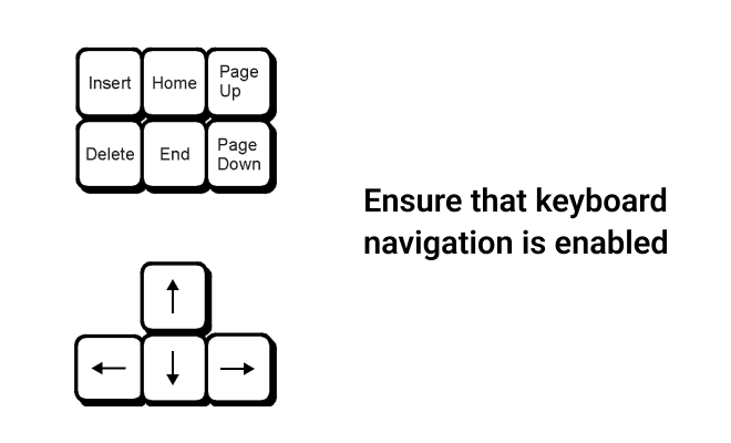
Optimizing keyboard navigation is fundamental for improving the accessibility of WordPress websites. Many individuals, particularly those with mobility impairments or limited mouse usage, rely on keyboards to navigate the web. By incorporating keyboard-friendly elements such as easily navigable menus and clickable links accessible via keyboard shortcuts, you empower users of all capabilities to access content independently. This approach not only benefits users with motor limitations but also fosters a more inclusive online environment. Websites that prioritize keyboard navigation align with accessibility guidelines, ensuring a seamless browsing experience for a broader audience. Embrace keyboard navigation to create a more accessible and inclusive WordPress website today!”
Enable Accessible Forms
Improving accessibility on your WordPress website is crucial for inclusivity. By implementing accessibility standards such as clear labeling of forms, logical tab orders, and concise error messages, you can make your site more navigable for users with disabilities. FormyChat, an intuitive and straightforward form-related plugin, helps streamline the form-filling process and ensures seamless interaction for diverse audiences. With features like autocomplete and robust form validation, FormyChat not only benefits users with disabilities but also enhances usability for all visitors. Make your WordPress site more accessible today with FormyChat!”

FAQ
What are some common accessibility issues on WordPress sites?
Common accessibility issues include a lack of descriptive alt text for images, poor color contrast, improper use of heading tags, unclear link text, and inaccessible forms or navigation menus.
ms.
Are there plugins available to help improve accessibility on WordPress?
Yes, there are several plugins designed to enhance accessibility on WordPress sites. These plugins can help with tasks such as generating alt text for images, checking color contrast, improving keyboard navigation, and optimizing forms.
What resources are available for learning more about web accessibility?
Many resources are available for learning about web accessibility, including online courses, tutorials, documentation, and community forums. Organizations such as the Web Accessibility Initiative (WAI) and WebAIM provide comprehensive guidelines and resources for improving accessibility.
Conclusion
To improve accessibility on your WordPress site, start by selecting an accessible theme and optimizing images with descriptive alt text. Utilize semantic HTML, ensure sufficient color contrast, and create descriptive links for clarity. Prioritize keyboard navigation and enable accessible forms for a seamless user experience. By embracing these strategies, you foster inclusivity and reach a broader audience while enhancing usability and SEO.
For any additional inquiries or if you need further assistance, feel free to reach out to us through Contact Us!

