Are you tired of your website looking clunky and outdated on mobile devices?
Do you want to ensure that your site is not only visually appealing but also functions seamlessly on smartphones and tablets?
If you answered yes to these questions, then you’re in luck! Are you looking for the perfect solution to make your WordPress website mobile-friendly without compromising on design or functionality?
Look no further! In today’s digital age, having the best responsive website is crucial for reaching your audience effectively.
Fortunately, numerous WordPress themes are specifically designed to adapt to various screen sizes, ensuring a consistent and enjoyable user experience across all devices.
Whether you’re a blogger, business owner, or freelancer, selecting the right and best responsive WordPress theme can significantly enhance your online presence and engage your visitors like never before.
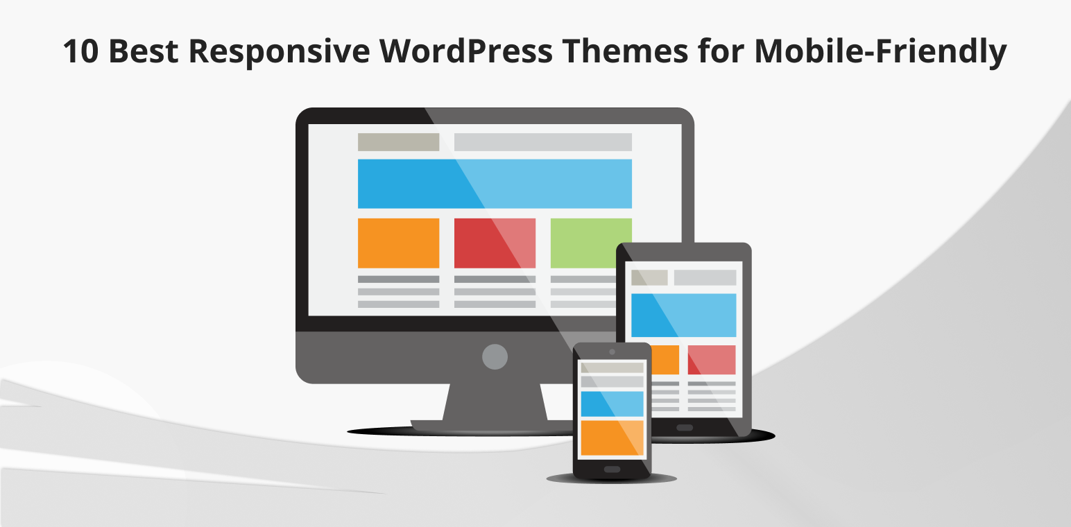
In this article, we’ll explore the top 10 best responsive WordPress themes that are sure to take your website to the next level.
Table of Contents
What is a Responsive WordPress Theme and Why Do You Need Responsive WordPress Themes?
A responsive WordPress theme is a website design that adjusts and adapts seamlessly to different screen sizes and devices. This means that the layout, images, and content of the website will automatically resize and reformat to fit the screen of the device being used, whether it’s a desktop computer, laptop, tablet, or smartphone. This ensures that the website remains user-friendly and visually appealing across various platforms, improving the overall user experience. Responsive WordPress themes are essential for modern websites as they cater to the growing number of users accessing the internet through mobile devices and tablets.
Many individuals browse websites through their cell phones rather than desktop computers. Utilizing a non-responsive theme on your site can lead to an unappealing and amateurish appearance, potentially causing conflicts across various desktop browsers.
Responsive design is crucial for developing professional websites. Not only does it enhance aesthetics, but it also plays a significant role in SEO rankings, particularly with search engines like Google. Mobile-friendly websites tend to rank higher and quicker, leading to increased traffic and potential business growth.
Investing in responsive WordPress themes is essential for staying competitive in the online realm and ensuring optimal user experience across various devices.
10 Best Responsive WordPress Themes For Mobile-Friendly
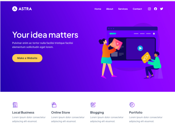
Astra
Astra is a lightning-fast, flexible responsive WordPress theme ideal for businesses, blogs, and online shops. Its mobile-friendly design guarantees a great look on smartphones, keeping your visitors engaged wherever they are. With Astra, you can effortlessly create custom layouts using popular page builders like Elementor and Beaver Builder, even if you’re not a coding whiz. It’s the perfect choice for building a user-friendly website that adapts flawlessly to any device.
Features
- Boasts rapid performance.
- Adaptable design for diverse purposes.
- Seamlessly integrates with popular page builders.
- Offers customizable layouts.
- Ensures excellent user experience on mobile devices.
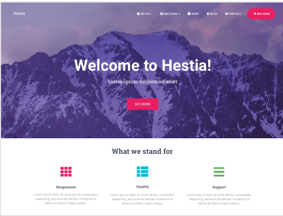
Hestia
Hestia is a modern and top-performing responsive WordPress theme that’s perfect for businesses, startups, and creative professionals. Its responsive design ensures that your website looks stunning on all devices, helping you make a memorable impression on your visitors. Hestia integrates seamlessly with popular page builders like Elementor and Beaver Builder, giving you even more control over the design of your website. It’s a top choice for creating a mobile-friendly website that stands out and captures the attention of your audience on any device.
Features
- Showcases a contemporary design ideal for businesses, startups, and creatives.
- Easily integrates with leading page builders.
- Promises top-tier responsiveness for consistent appeal across devices.
- Empowers effortless customization without coding.
- Guarantees memorable user experiences on various gadgets.
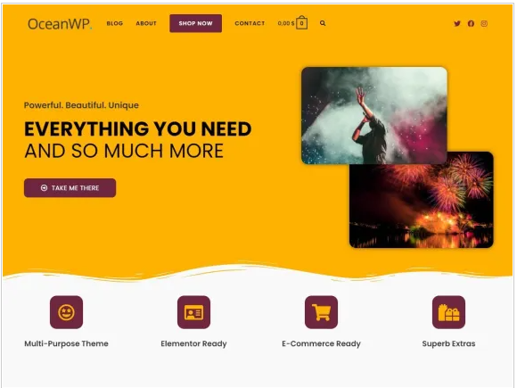
OceanWP
OceanWP is a lightweight and highly customizable responsive WordPress theme crafted for speed and performance. Its responsive layout guarantees swift loading times and a stunning appearance across all gadgets, delivering a seamless browsing journey to your audience. With seamless integration with renowned page builders like Elementor and Beaver Builder, OceanWP empowers you with added versatility and command over your website’s design. It stands out as a premier option for crafting mobile-friendly websites that boast swift loading speeds and optimal performance on smartphones and tablets alike.
Features
- Prioritizes speed and adaptability.
- Provides extensive customization options for optimal performance.
- Offers swift loading times and captivating visuals on all devices.
- Seamlessly integrates with page builders.
- Ensures exceptional mobile performance and aesthetics.
Avada
Avada is a versatile and feature-rich WordPress theme that’s perfect for creating a wide range of websites, from portfolios to online stores. Its responsive design ensures that your website looks great on mobile devices, helping you reach and engage with your audience wherever they are. With Avada, you get access to a plethora of customization options, allowing you to tailor your website to your specific needs and preferences without any coding knowledge required. It’s an ideal solution for building a mobile-friendly website that provides an optimal viewing experience across different devices.
Features
- Offers versatility and rich features for diverse website needs.
- Ensures responsiveness for mobile-friendly viewing.
- Provides a vast array of customization options.
- Simplifies customization without coding expertise.
- Ideal for crafting tailored, mobile-friendly websites.
Divi
Divi is a leading drag-and-drop WordPress theme and page builder, renowned for its versatility. It offers a wide range of layouts, templates, and full site packs, allowing users to customize designs effortlessly. With the Divi Builder, users have full control over their websites, including module placement and design adaptability across various screen widths. Plus, it offers mobile-friendly website packs, eliminating the need for manual mobile optimization.
Features
- Distinguished drag-and-drop theme and builder.
- Grants complete control over website design across devices.
- Offers an array of layouts, templates, and site packs.
- Simplifies mobile optimization with ready-to-use packs.
- Eliminates manual mobile optimization hassles.
Neve
With over 300,000 active installations, Neve is prized for its lightweight and versatile design. Its responsive layout ensures seamless viewing on mobile devices, prioritizing speed and user satisfaction. Compatible with leading page builders, Neve empowers users to create customized, mobile-friendly websites to suit their needs effortlessly.
Features
- Lightweight and adaptable with a substantial user base.
- Prioritizes speed and user satisfaction with its responsive layout.
- Seamlessly integrates with leading page builders.
- Facilitates effortless creation of customized, mobile-friendly websites.
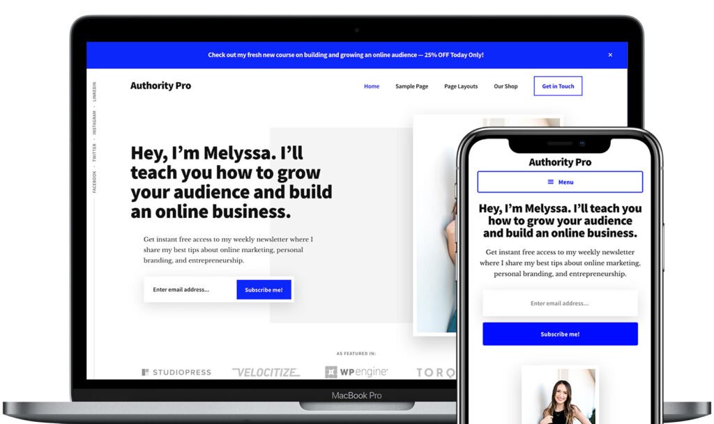
Authority Pro
Authority Pro is a premium WordPress theme renowned for its professional design and versatile features. Developed by StudioPress, it’s a top choice for creating sophisticated websites focusing on authority and credibility. With its clean layout and robust customization options, Authority Pro empowers users to build impactful online presences for businesses, bloggers, and professionals. Its adaptable design guarantees a smooth viewing experience on various devices, while its incorporation with the Genesis Framework establishes a robust basis for security and performance.
Features
- Exhibits professional design with robust features.
- Features a clean layout and extensive customization options.
- Delivers smooth user experiences across devices.
- Ensures security and performance with Genesis Framework integration.
- Perfect for establishing authoritative online presences.
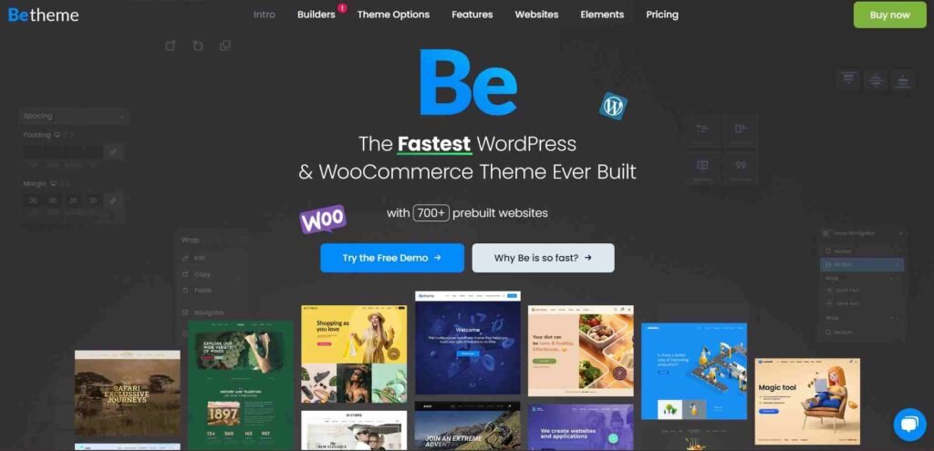
Betheme
BeTheme is a popular multipurpose WordPress theme known for its versatility and extensive collection of pre-designed templates. It has gained significant popularity within the WordPress theme, boasting over 500,000 purchases. It offers a wide range of customization options, allowing users to create various types of websites easily. BeTheme is favored for its user-friendly interface, extensive documentation, and regular updates, making it a preferred choice for both beginners and experienced WordPress users alike.
Features
- Offers multipurpose functionality with an array of templates.
- Provides a user-friendly interface and comprehensive documentation.
- Ensures regular updates and extensive customization capabilities.
- Trusted by a large user base for its versatility and ease of use.
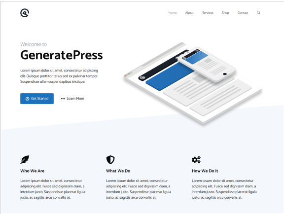
GeneratePress
Looking for a fast, intuitive WordPress theme? GeneratePress is your answer. It’s lightweight, SEO-friendly, and adheres to WCAG standards, making website construction effortless without coding. It’s perfect for beginners with full responsiveness and a built-in Gutenberg editor. Developers love its customization options and seamless plugin creation. Benefits include improved website speed, SEO boost, flexible design, easy content creation, and simplified development.
Features
- Promises speed, intuitiveness, and SEO-friendliness.
- Adheres to WCAG standards and includes a built-in Gutenberg editor.
- Boosts website speed and SEO performance.
- Facilitates flexible design and content creation for users.
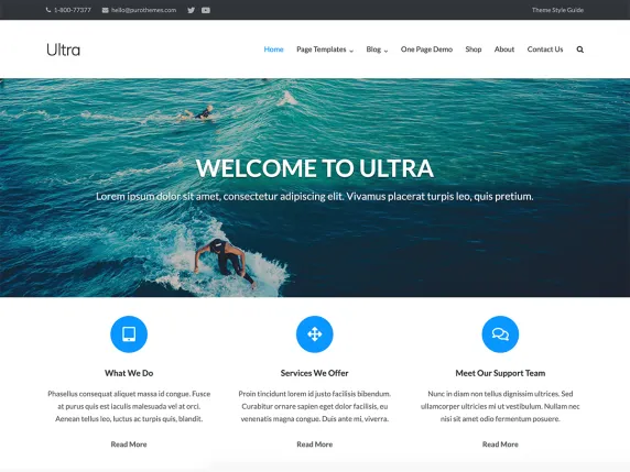
Ultra
Ultra is a versatile WordPress theme developed by Themify, offering extensive customization options and responsiveness. While it may not have as many active installations as some other themes, Ultra stands out for its robust features and flexibility. With a drag-and-drop builder and pre-designed templates, users can easily create unique website layouts. Ultra ensures optimal viewing experiences across all devices, including smartphones and tablets. While its exact popularity may vary, Ultra remains a solid choice for those seeking a customizable and responsive WordPress theme.
Features
- Provides extensive customization options and versatility.
- Empowers users with a drag-and-drop builder and pre-designed templates.
- Ensures optimal viewing experiences across all devices.
- Allows for unique website layouts tailored to specific needs.
- Suitable for various website types and customization preferences.
FAQ
Are there any SEO benefits to using a responsive WordPress theme?
Yes, using a responsive WordPress theme can improve your website’s SEO performance. Search engines like Google prioritize mobile-friendly websites in their search results, leading to higher rankings and increased visibility.
Can I switch to a responsive WordPress theme if my current theme is not mobile-friendly?
Yes, you can switch to a responsive WordPress theme even if your current theme is not mobile-friendly. Simply install and activate a new responsive theme, and your website will automatically adapt to different screen sizes.
How do I know if a WordPress theme is responsive?
You can test a WordPress theme’s responsiveness by viewing its demo site on different devices or using online tools like Google’s Mobile-Friendly Test. Additionally, inspecting the theme’s code for CSS media queries can confirm its responsiveness.
Conclusion
In conclusion, selecting the best responsive WordPress theme is crucial for ensuring your website remains visually appealing and functional across all devices. From lightning-fast options like Astra and OceanWP to versatile choices like Divi and BeTheme, there’s a theme to suit every need. Investing in a responsive theme not only enhances aesthetics but also boosts SEO rankings and user engagement. Don’t let your site fall behind—choose one of these best responsive WordPress themes and elevate your online presence today.
Feel free to submit your inquiries via our Contact Us section. We are committed to promptly addressing all your concerns. Your continued support is deeply appreciated; remember to follow us on Facebook and Twitter.